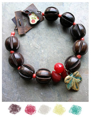
Oh, color - it is such an exciting part of our job and yet it can sometimes be completely overwhelming. Some designers have a natural instinct for color. Others struggle, some search out the experts for helpful advice, some pull out the color wheel and rely on the faithful results of color theory.
Wherever you fall on the spectrum, you can find endless opportunities for color inspiration using Pantone's Color Forecasts. You can download the Fall 2010 Forecast
here. I wrote an article with tips for using the fall color palette, jewelry samples and a printable color worksheet. You can view them on my website
here.
I think the hardest part of seeing a list of colors, like the palette above, is trying to figure out how they translate into beads and jewelry.
I've gathered 4 examples from our ABS Contributors to help inspire your color adventures.
Erin Prais-Hintz combined golden glow, endive, oyster gray and chocolate to create a monochromatic design that is anything but boring! This necklace sings a fall color melody that hits all the right notes. Art bead:
Humblebeads.Next
Lori Anderson has paired a lovely collection of art beads offering just a hint of color in this light and airy collection. The earthy palette mixed with creams whisper a softer expression of fall designs. This would be a great transition piece as we move from summer to crisp fall days. I could see it paired with a gray cardigan and your favorite jeans. Here we see oyster gray, a darker shade of purple orchid, chocolate, lagoon and a hint of golden glow in the accent beads. Art Beads:
Floridity and lampwork by
Lori Anderson.Lorelei Eurto has gathered together a mouth-watering combination that is inspired by the fruits of the season and the trees associated with them. There is a delicious play of lipstick red and chocolate truffle that add zing to this design. Touches of oyster gray, endive and lagoon add depth to this playful palette. Art beads:
Jade Scott and
Earthenwood Studio.Shannon Levart offers a reserved color palette that is anything but boring. What creates such visual interest in this design? Texture! Shannon brings color into her
findings with a dark chocolate truffle patina that echoes the details in the light golden glow of the wing pendant. The stone egg in shades of oyster gray provide another contrast of texture. She named this piece
Transcend and the colors do offer a heavenly combination! Art bead:
Earthenwood Studio.
(You may notice two additions to our sidebar and I'd like to officially welcome Lori Anderson and Erin Prais-Hintz as regular contributors. We loved them so much as guest writers, we just had to snatch them up to write for you on a regular basis!)


